
 15 Topics
 5 Days
Programme Overview
Training Description
Financial Analysts
Budget and Forecasting Managers
Financial Planners
Senior Accountants
Business Intelligence Analysts
CFOs and Finance Directors
Data Analysts
Project Managers
Operations Managers
Strategic Planners
Session Objectives
- Understand the principles of effective data visualization. Learn to choose the correct chart type for different budget metrics. Master data preparation and cleaning for visualization tools. Design and build interactive, user-friendly dashboards. Develop compelling visual narratives from financial data.
About the Course
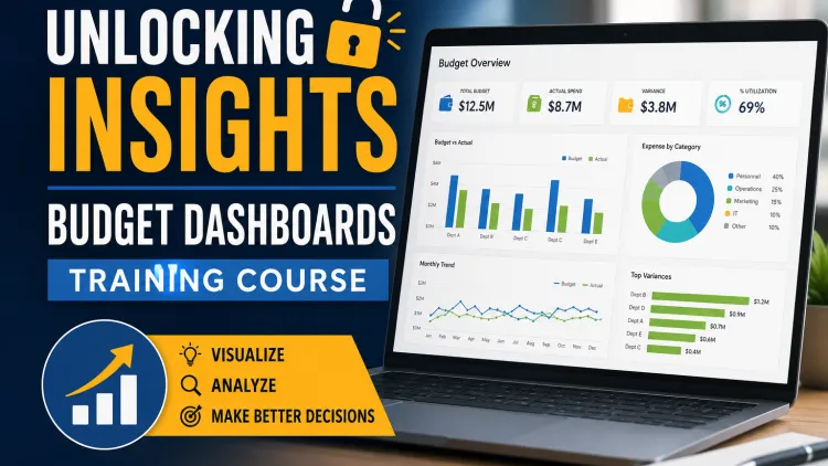
In today's fast-paced business environment, static spreadsheets and complex reports are no longer sufficient for effective financial management. The ability to quickly and clearly visualize budget data is paramount for making agile, informed decisions. Budget visualization and interactive dashboards transform raw data into a compelling narrative, allowing finance professionals to identify trends, pinpoint variances, and communicate critical insights to stakeholders with unprecedented clarity. This shift from data presentation to data storytelling is a key differentiator for high-performing finance teams, enabling them to move beyond traditional reporting and become strategic partners to the business.
This comprehensive 10-day training course is meticulously designed to equip finance, accounting, and business professionals with the skills needed to master the art of budget visualization. Participants will engage in hands-on exercises to build dynamic, interactive dashboards from the ground up, learning to select the right charts, design intuitive layouts, and connect their work to powerful business outcomes. By the end of this program, you will be able to not only create stunning visualizations but also use them as a powerful tool to drive data-driven conversations and influence strategic planning across your organization.
Curriculum & Topics
15 Topics | 5 Days
-
 Subtopic 1.1:
The importance of visual storytelling in finance.
Subtopic 1.1:
The importance of visual storytelling in finance.
-
Subtopic 1.2:
Understanding human perception and cognitive load.
-
Subtopic 1.3:
The difference between charts, graphs, and dashboards.
-
Subtopic 1.4:
Key design principles: clarity, simplicity, and consistency.
-
Subtopic 1.5:
Avoiding common pitfalls in data visualization.
-
Subtopic 2.1:
How to build a narrative with your financial data.
-
Subtopic 2.2:
Identifying the key message or insight.
-
Subtopic 2.3:
Structuring your visualization for a logical flow.
-
Subtopic 2.4:
Using annotations and text to guide the viewer.
-
Subtopic 2.5:
The power of context in data presentation.
-
Subtopic 3.1:
When to use bar, line, and pie charts.
-
Subtopic 3.2:
Advanced chart types: scatter plots, heat maps, and bubble charts.
-
Subtopic 3.3:
Visualizing budget vs. actuals with variance charts.
-
Subtopic 3.4:
Displaying budget hierarchies with treemaps.
-
Subtopic 3.5:
Choosing charts for trend analysis and forecasting.
-
Subtopic 4.1:
The importance of clean data for accurate visuals.
-
Subtopic 4.2:
Connecting to various data sources (Excel, SQL, cloud).
-
Subtopic 4.3:
Cleaning and transforming data for analysis.
-
Subtopic 4.4:
Handling missing values and data inconsistencies.
-
Subtopic 4.5:
Best practices for data governance.
-
Subtopic 5.1:
Overview of popular BI tools: Tableau, Power BI, and Google Data Studio.
-
Subtopic 5.2:
Navigating the user interface and basic functionality.
-
Subtopic 5.3:
Importing and structuring your first dataset.
-
Subtopic 5.4:
Building simple visualizations.
-
Subtopic 5.5:
Understanding the role of dimensions and measures.
-
Subtopic 6.1:
Step-by-step guide to building a core budget dashboard.
-
Subtopic 6.2:
Visualizing performance against budget targets.
-
Subtopic 6.3:
Calculating and displaying variances in real-time.
-
Subtopic 6.4:
Using color theory to highlight positive and negative performance.
-
Subtopic 6.5:
Adding key performance indicators (KPIs) to the dashboard.
-
Subtopic 7.1:
Adding filters and slicers for user-driven exploration.Creating drill-down functionality to explore details.
-
Subtopic 7.2:
Creating drill-down functionality to explore details.
-
Subtopic 7.3:
Using parameters to allow users to change variables.
-
Subtopic 7.4:
Building dynamic dashboards that respond to user input.
-
Subtopic 7.5:
Designing a user experience that is intuitive and engaging.
-
Subtopic 8.1:
Using treemaps and sunburst charts for hierarchical data.
-
Subtopic 8.2:
Displaying budget distribution across departments or projects.
-
Subtopic 8.3:
Creating stacked bar and area charts for allocation breakdown.
-
Subtopic 8.4:
Benchmarking departmental performance.
-
Subtopic 8.5:
Visualizing resource utilization and capacity.
-
Subtopic 9.1:
Visualizing historical trends in spending and revenue.
-
Subtopic 9.2:
Using line charts and dual-axis charts for comparison.
-
Subtopic 9.3:
Implementing forecasting models within the dashboard.
-
Subtopic 9.4:
Displaying predictive analytics visually.
-
Subtopic 9.5:
Creating custom calculations for financial ratios and metrics.
-
Subtopic 10.1:
Using calculated fields to create new metrics.
-
Subtopic 10.2:
Implementing dashboard actions for cross-sheet interaction.
-
Subtopic 10.3:
Creating compelling maps for geographical data.
-
Subtopic 10.4:
Building custom shapes and icons to enhance visuals.
-
Subtopic 10.5:
Advanced formatting and customization.
-
Subtopic 11.1:
Understanding data governance within a dashboard environment.
-
Subtopic 11.2:
Setting up user permissions and access control.
-
Subtopic 11.3:
Ensuring data is secure and compliant with regulations.
-
Subtopic 11.4:
Best practices for sharing dashboards internally and externally.
-
Subtopic 11.5:
Auditing dashboard usage and data access.
-
Subtopic 12.1:
Strategies for making your dashboards load faster.
-
Subtopic 12.2:
Reducing data extract sizes and optimizing queries.
-
Subtopic 12.3:
Best practices for dashboard layout and design.
-
Subtopic 12.4:
Understanding the impact of complex calculations on performance.
-
Subtopic 12.5:
Troubleshooting common performance issues.
-
Subtopic 13.1:
How to effectively present a dashboard to stakeholders.
-
Subtopic 13.2:
Tailoring your presentation to different audiences.
-
Subtopic 13.3:
Highlighting key insights and actionable takeaways.
-
Subtopic 13.4:
Answering questions and guiding a data-driven conversation.
-
Subtopic 13.5:
Using dashboards to influence decision-making.
-
Subtopic 14.1:
Designing dashboards that are effective on small screens.
-
Subtopic 14.2:
Best practices for mobile-first visualization.
-
Subtopic 14.3:
Optimizing layouts for different device types.
-
Subtopic 14.4:
Understanding the limitations of mobile dashboards.
-
Subtopic 14.5:
Creating a seamless user experience across platforms.
-
Subtopic 15.1:
The role of dashboards in driving business strategy.
-
Subtopic 15.2:
Encouraging data literacy across the organization.
-
Subtopic 15.3:
Establishing a Center of Excellence for data visualization.
-
Subtopic 15.4:
Implementing a continuous improvement cycle for your dashboards.
-
Subtopic 15.5:
The future of financial visualization and your role in it.